Sunday, 9 May 2010
Wednesday, 5 May 2010
Monday, 3 May 2010
Magazine and Poster Mock Ups ...
Sunday, 2 May 2010
Storyboards ...
Risk Assessment Forms ...
 In order to rule out any potential risks that could be encountered during filming we highlighted all the problems we could possibly encounter, gave them a score of either high, medium or low, and then made suggestions as to how these could be resolved or avoided. This meant that when we began filming we were able to avoid any risks.
Venue Release Forms ...
Costumes ...

The main actress's make up was kept minimalistic and natural so that the character would appear more 'real', which would make her more identifiable to the audience.

The ghost character's costume is an old-fashioned style night gown which highlights the age of the ghost and reflects the period of her life.

Props and Equipment ...
- Camera
- Tripod
- Batteries
- Torch
- Doll
- Chair
- Mirror
- Mug
- Magazine
Cast ...
Locations ...
Production Schedules ...
- 3rd March 2010 - 12.15pm. Location: 6, Millbank Lane, Maghull (Attic)
- 5th March 2010 - 12.00pm. Location: 6, Millbank Lane, Maghull (Stairs)
- 7th March 2010 - 5.00pm. Location: 254A Southport Lane, Lydiate. (Kitchen, stairs, 2 bedrooms & bathroom.)
- 8th March 2010 - 8.30am. Location: 254A Southport Lane, Lydiate. (Outside)

Questionnaire and Poll Results ...
Sunday, 28 February 2010
Questionnaire ...
http://spreadsheets.google.com/viewform?formkey=dGFhSEpmZVE3bmFfWVlOT05nengtU2c6MA
Tuesday, 23 February 2010
HP and the Half Blood Prince Trailer Analysis ...
The movie trailer for Harry Potter and the Half Blood Prince follows a formula used for the whole series of the Harry Potter films; a mix between the darker major themes and the light comical aspects of the 'coming of age' style humour. This trailer displays perhaps less of the comedy and more of the darker nature of this film. The music that has been adapted between each film has now developed a more melancholy tone. The score, as is typical in most major movie trailers, follows the cuts and provides emphasis to the narration, when important parts of speech are emphasised with a quick end to the music, for example when Dumbledore quotes, "This time I cannot hope to destroy it alone."
The establishing shot is of the cave that is central to the film's storyline, with the two main characters framed upon an outcrop of rock. The striking image provides a hook to the viewer and introduces the setting of the film.
The trailer then introduces the two main characters, followed by a montage of small clips from the movie; which shows in a brief flash the major themes throughout the film. This technique shows the audience what to expect without giving away huge amounts of the plot and creates a dramatic atmosphere.
The production company logo of Warner Brothers has been repeatedly, with each film in the series, adapted to fit the melancholy tone of the film. The difference can be seen below;

The original uses bright colouring, whereas the Harry Potter brand is transformed into the darker colour scheme, which fits into the tone of the rest of the film.
The narrative uses a composition of direct quotes from the film and a narrative enigma; an unknown speaker that explains key plot points from the movie and entices the audience into wanting to watch the film.
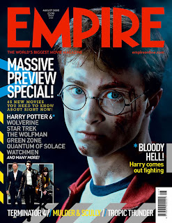
HP and the Half Blood Prince Magazine Cover Analysis ...

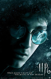
Harry Potter and the Half Blood Prince Poster Analysis ...
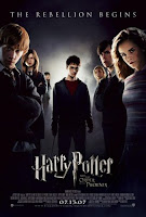
 The movie poster for Harry Potter and the Half Blood Prince is atypical of the style often used within the Harry Potter empire. The blue/grey tint used to leech the image of colour evokes a more haunting and forbidding atmosphere contrary to the previous film's advertising, (as can be seen below), which hints at the film's darker storyline.
Thursday, 18 February 2010
Shutter Island Trailer Analysis ...
The Shutter Island movie trailer is a clear reflection of the horror/thriller genre. The conventions explored in the genre include quick cuts and montage edits to establish pace and suspense within the trailer's narrative.
The graphic captions used (as can be seen below) feature an 'ink blot' design scheme created to reflect the psychoanalytical technique of of finding a picture within it. This is a clear link to the theme of mental illness that the film explores. Other than the film title the only other billing block is of the director, Martin Scorsese's name. This is suggestive of his notoriety as a director and how this makes the need for further audience incentive techniques unnecessary.

There is an unearthly and disturbing tone to the score in the film. Using a link of high-pitched screeching in between the shots creates an atmosphere of unrest and horror. In addition to this the narrative relies on direct speech taken from the film, including conversations between the characters. This means that whilst the narrative seems enigmatic, it directly involves the audience in the action.
The range of shots relies of the differences in significant objects within the film. For example, close up shots are used on important objects such as the federal marshal badge and the actor's faces, displaying their emotions effectively to evoke similar reactions in the audience. Long shots are used to establish the location and provide a setting for the action.

Friday, 29 January 2010
Shutter Island Magazine Front Cover Analysis ...
 The magazine 'Total Film' published a feature on 'Shutter Island' which included this front cover. Aside from the usual conventions shown on each cover; such as the masthead, bar code and issue number; the cover is almost entirely taken over by the shutter island style model. The use of the movie's signature red font is not only used to advertise Shutter Island itself, but also on the magazine's other features.
The image of DiCaprio differs from the movie poster's close up, but features the actor's similar grim facial expression and ominous dark blue and grey colour scheme. There is also a swirling mist around his lower body, which is synonymous with horror movies. He is shot at a long, middle angle maing him seem tall and imposing, posed with one leg slightly forward to place emphasis on the gun placed directly before it. His police badge is also clearly visible on his clothes which gives his costume an official appearance, in a typical 50's overcoat. The image of the lighthouse is placed before the masthead, naturally giving it a dominance over the whole cover. This links directly to its significance on the island.
The anchorage text of 'Marty's Madhouse' is a reference to the director Martin Scorsese and links to the mental hospital in which the film is located.
Wednesday, 27 January 2010
Shutter Island Movie Poster Analysis ...

The film 'Shutter Island' from director Martin Scorsese is a thriller; created from the original novel by Dennis Lehane. It charters the journey of US Marshall Teddy Daniels as he investigates a case in the Alcatraz-style mental hospital on Shutter Island.
There are constant themes throughout all elements of the film's marketing: the more famous, main star Leonardo DiCaprio, the image of the island itself, and the logo text 'Shutter Island'.
DiCaprio's image is leached of colour in a low saturation edit, giving a universal colour scheme of dark grey and blue, which provides a striking contrast with the red, blurred text. The image of him holding a match up to his face is taken directly from a scene in the film, and is suggestive of darkness. The fact the actor is looking to the side and not straight into the camera also makes the image seem ominous, as the audience are led to suspect he is looking at something they can't see. Although the image is highly edited, there is a sense of him being a rugged male character, naturally associated with strength, as he has stubble and deep lines between his eyes.
The tag line of 'Someone is missing' is placed directly atop the lit match, meaning it is laced in smoke. This is an effect commonly used in horror/thriller genres and gives a clear indication of the forbidding nature of the film.
The image of the island has been given a back-lighting effect which casts an ethereal glow around the dark, hostile cliffs. The contrast makes the island seem foreboding and the waves around the perimeter along with the rain effect in front makes it seem wild and turbulent.
The red, blurred text evokes imagery of blood; whilst looking as though a hand has swept across the wet ink making it run slightly. This is a continuation of the thriller theme and is used also in the release date "October" (which incidentally has since been moved forward) which draws the audience's attention and provides an easily remembered point.


